Our recent packaging design project involved creating a unique label for a premium Rakija that has been aged for five years in oak barrels. The client entrusted us with this task, aiming to capture the essence of their family story, which spans several decades. The label prominently features a striking graphic that reflects this rich heritage, serving as the focal point of the design.
To...
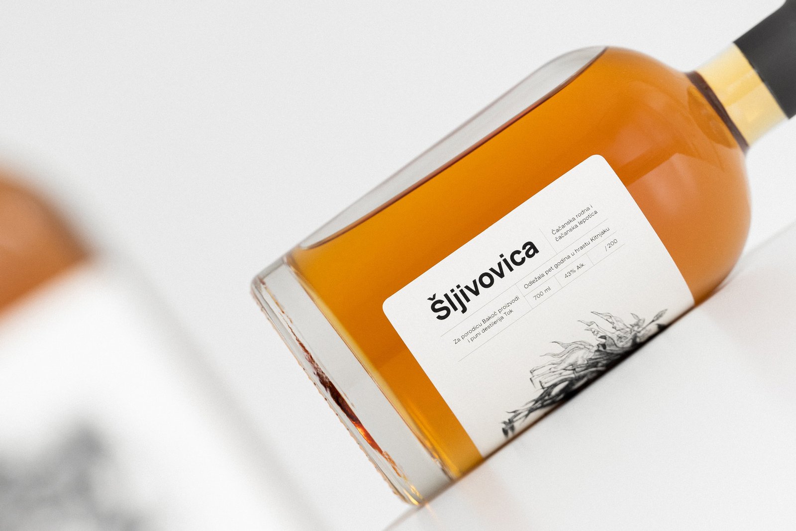
Our recent packaging design project involved creating a unique label for a premium Rakija that has been aged for five years in oak barrels. The client entrusted us with this task, aiming to capture the essence of their family story, which spans several decades. The label prominently features a striking graphic that reflects this rich heritage, serving as the focal point of the design.
To complement the illustration without overshadowing it, we incorporated minimal text, placed vertically along the edge of the bottle. This thoughtful placement maintains the visual hierarchy and allows the artwork to shine. Additionally, we included a dedicated space for a handwritten serial number, emphasizing the exclusivity of the limited run of only 200 bottles, making each one a unique gift.
Our attention to detail extended to the printing process, selecting high-quality paper, rounding the edges, and finishing the bottle with an elegant matte black cap, ensuring a sophisticated and memorable presentation.